
The challenge
INTECH needed a website that could explain its work as clearly as the team would in a conversation. Visitors needed to understand the difference between a website, a web application, a mobile application, and technology consulting, then find the right next step. The visual identity also needed to work beyond the logo: distinctive enough to remember, but calm enough to read. Alongside that, the site had to support Thai and English and make room for future project stories without redesigning the archive each time.
The solution
We organized the experience around services, work, our approach, insights, and contact. The supplied INTECH identity became the basis for the typography, blue-and-midnight palette, geometric artwork, and restrained transitions. Content is rendered into complete pages, with small interactive modules for navigation, motion, project discovery, and preparing a brief. A shared set of page templates handles both languages, while each approved project gets its own case study with images, context, and delivery details.
Scope of work
- Information architecture and service content
- Brand application and responsive interface design
- Thai and English routes, copy, and language switching
- SVG artwork, entrance motion, and service text animation
- Project archive, search, filters, and case study templates
- Project brief form with local text-file download
- Metadata, accessibility checks, and automated verification
Behind the build
A website built for our own business
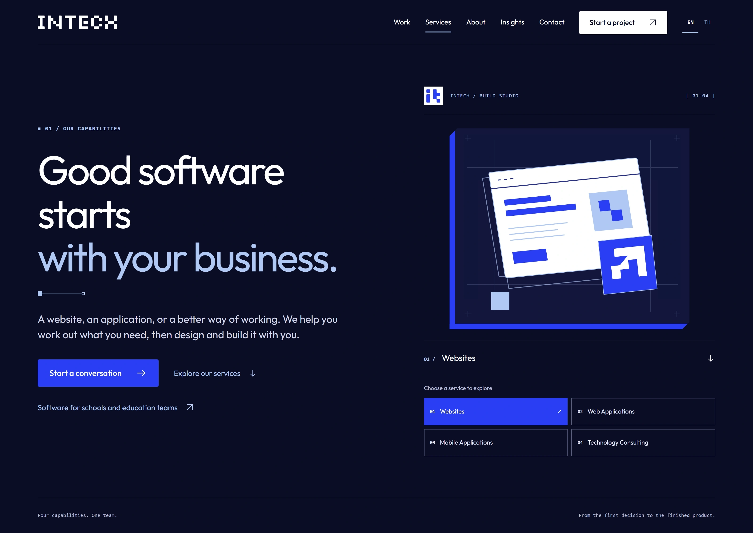
This is INTECH’s own corporate website, designed and developed as an in-house project. The September 2026 edition brings the brand, service information, and project publishing system into one place. It also gives prospective clients a practical way to understand our approach before starting a conversation.
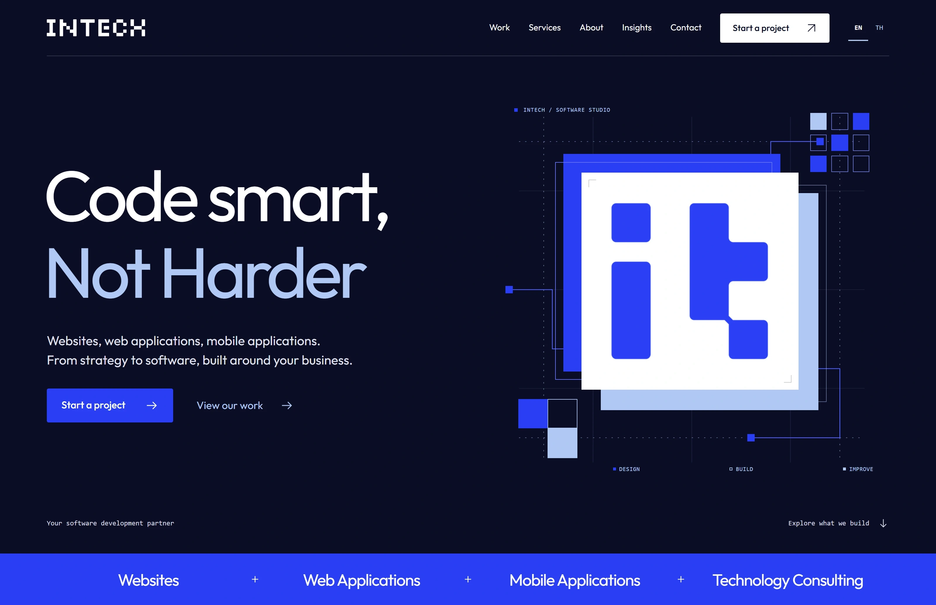
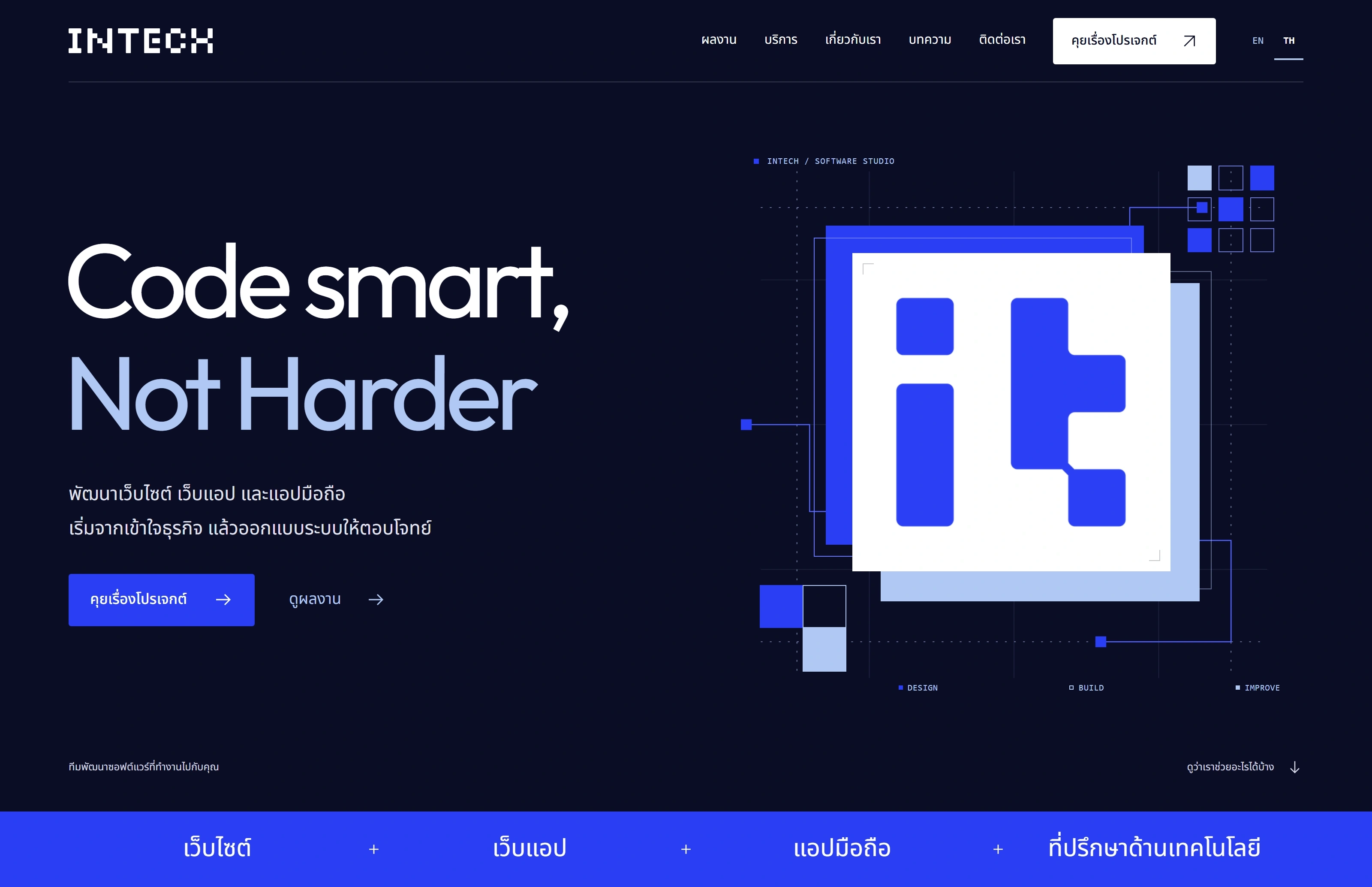
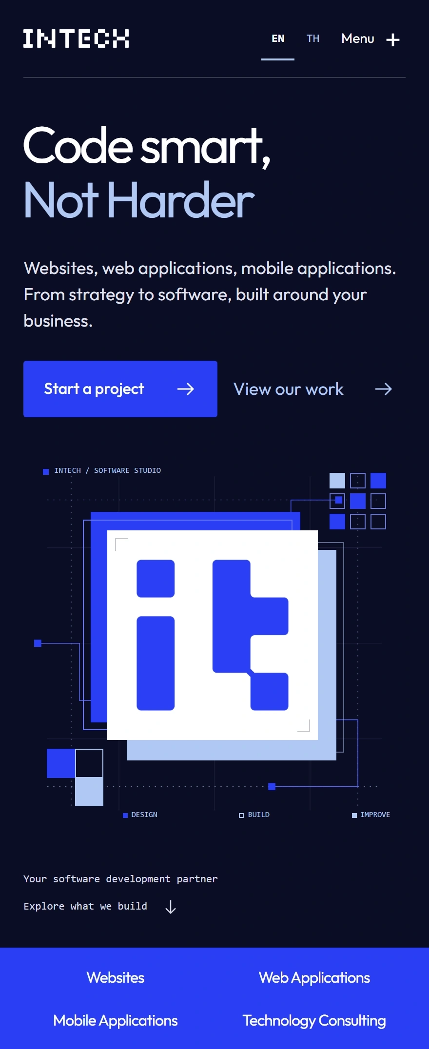
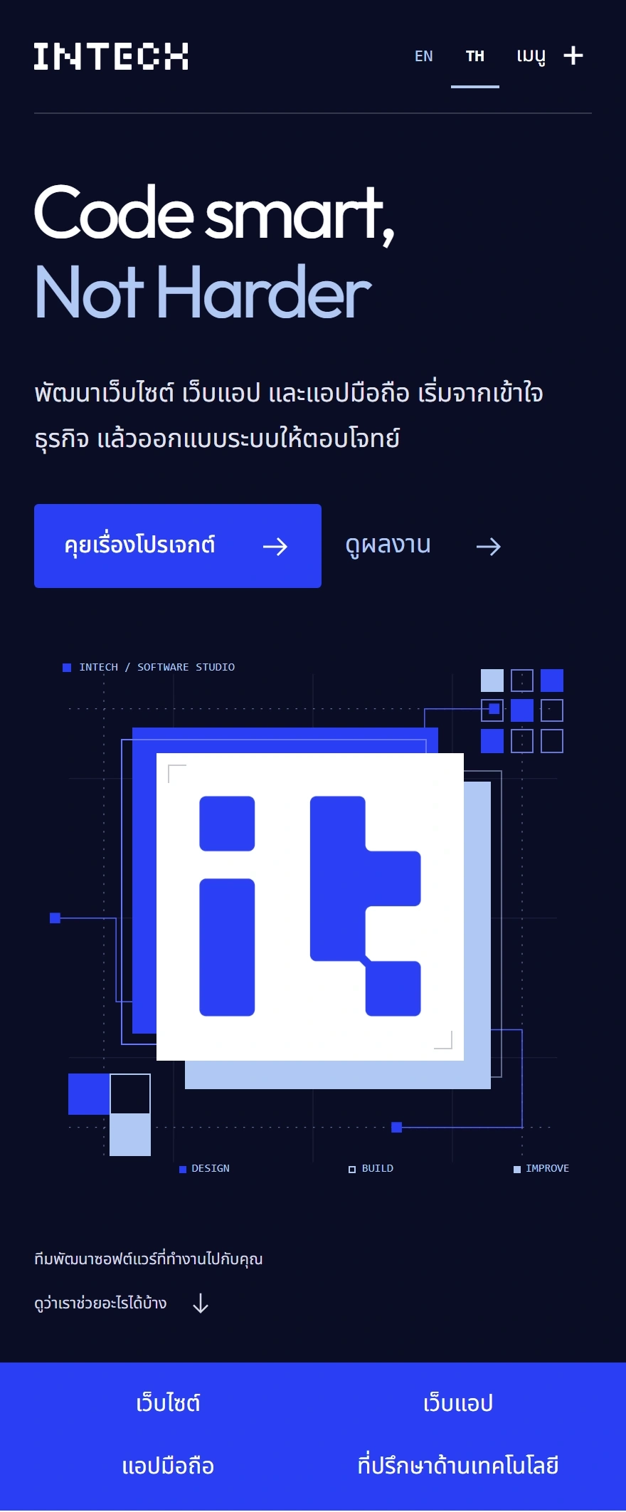
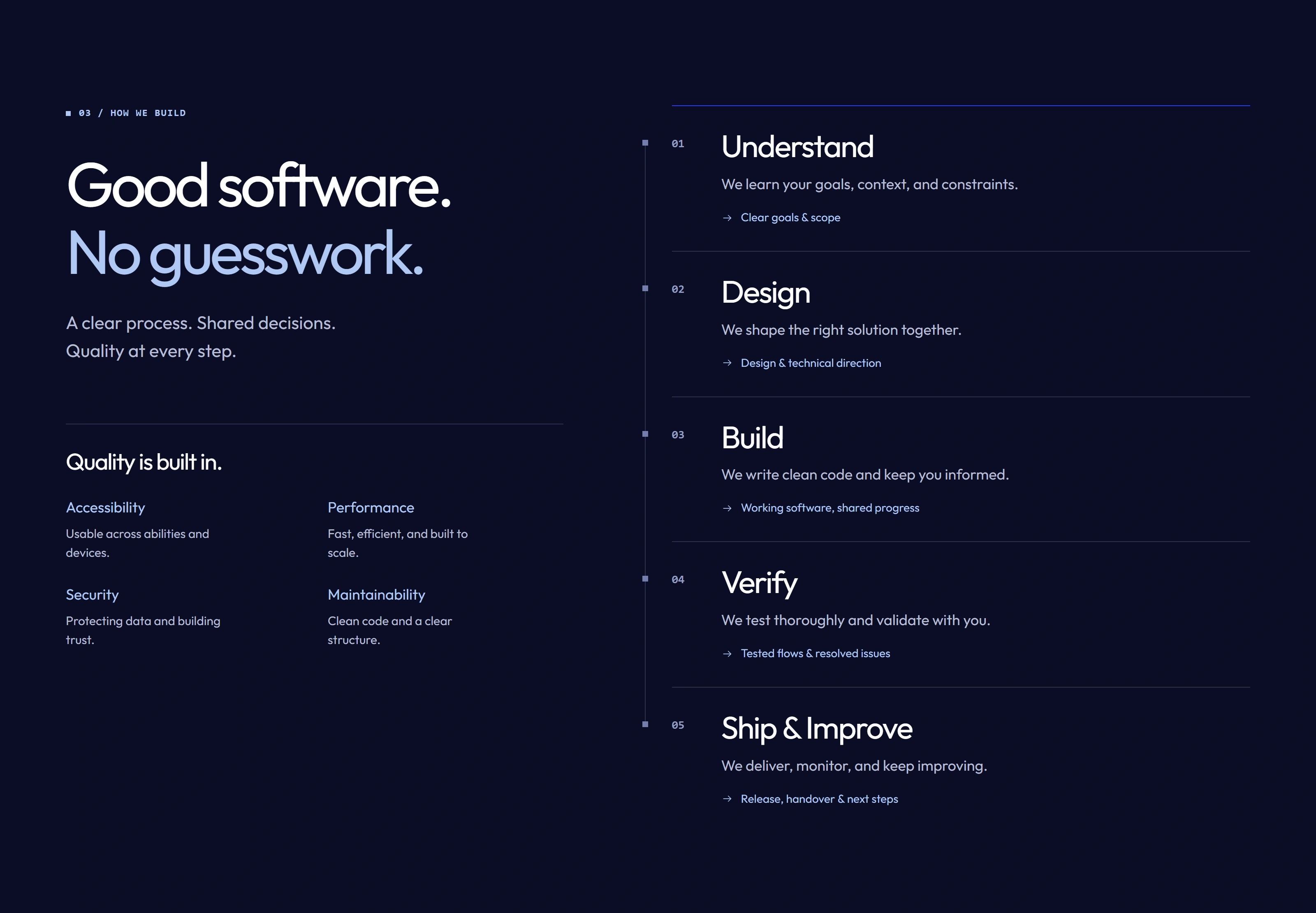
The screenshots show the version updated on 20 October 2026. The project date remains September 2026.
Carrying the identity through the experience
The supplied wordmark stays at the center of the identity. Blue, midnight, and pale blue define the page rhythm, while generous space and large headlines keep the message direct. The homepage places the original INTECH lettermark on a white plane over blue and pale layers. SVG connections and square modules carry that same visual language into the surrounding composition.
“Code smart, Not Harder” remains in English in both editions. The supporting Thai copy is written for the context rather than matched word for word, and the typography gives Thai text the line spacing it needs.
Motion with a clear role
The first visit introduces the INTECH wordmark and a skeleton composition for 1.4 seconds. Visitors can enter immediately using the provided control, and internal navigation skips the introduction. The hero assembles into place, the service rail travels in a continuous loop, and the process line follows the reader through the page.
These details have controls and fallbacks. The service rail can be paused. Reduced-motion preferences produce a quieter experience, and readable content and essential navigation remain available if animation scripts do not run.
A publishing structure that can grow
Work is stored as structured Markdown content. The archive supports categories, search, and incremental loading, with filters preserved in the URL. Each case study can include the challenge, solution, scope, gallery, outcomes, and technology choices. Sections without content are omitted.
Thai and English entries share one public project slug but remain separate files. Publication requires an approved, non-draft entry. When a translation is not ready, the site can show the approved version with a clear language notice. That keeps the archive useful without presenting unfinished writing as published work.
Keeping the implementation understandable
Astro generates the pages ahead of time. TypeScript defines the application boundaries, and small browser modules handle the parts that need interaction. Shared templates and content schemas keep rendering separate from project information and publishing rules.
The project brief is deliberately local: validation runs in the browser and the download produces a text file on the visitor’s device. It does not submit an inquiry. Deployment headers define the site’s content security policy, while the fonts and brand assets are served with the website.
Checking the journeys that matter
Verification covers opening pages, following service links, changing language, finding a project, reading its details, using the mobile menu, and downloading a brief. Responsive layouts, keyboard controls, reduced motion, and automated accessibility checks are part of that work. The same checks give us a repeatable way to review changes as new content and features are added.
Project gallery
Outcomes
- A complete Thai and English website, with language switching that retains the current page and section.
- A reusable project archive where new approved entries create their own cards and detail pages.
- Responsive layouts and keyboard-operable navigation, with a reduced-motion alternative.
- A project brief visitors can download and review locally before sharing.
- Automated checks for content approval, navigation, forms, responsive layouts, and accessibility.
Technology
- Astro
- TypeScript
- Tailwind CSS
- Motion
- SVG
- Markdown
- Zod
- Playwright
- Vitest